
Strategium Billing Center is a Belgian e-invoicing application: invoices, quotes, credit notes and sending through Peppol, in a market where structured invoicing is becoming mandatory. The app was already live and had active users. The redesign started from what I learned in interviews: people were not getting stuck on features, but on decisions. Which VAT rate applies, whether the amount is entered correctly, what kind of document this actually is.
The users are not accountants and do not come from tech. They invoice from a phone, between two other jobs, often for clients in other countries and in a language that is not their own. The app had everything it needed, but every screen assumed you already knew: which VAT rate applies, what a credit note is, whether the document actually went out through Peppol. When they got stuck, people did not look inside the app. They called the team.
I started from interviews with active users and with the owner of the application, then rewrote the flows around the decisions that were stopping them. One thing to do per screen, the explanation right where the decision is made, official data pulled in automatically instead of fields to fill, and a visible response after every action. No new feature added just to be there.
One interview session with three or four active users and the owner of the application. A small sample, and I will say so plainly: on a niche product, a handful of people doing the same work every day tell you more than a hundred survey responses. Having the client in the room added the part users never see: what questions the team was fielding on the phone.
The VAT percentage trips them up every time. It is not an interface problem, it is a knowledge problem, and it is solved with an explanation at the point of decision, not with a prettier field.
Zeros and the decimal comma are a constant source of mistakes. The same goes for the bank account: it gets read twice before sending.
Most of them work from mobile, not from a desk. Any flow that assumes a large screen and patience fails from the start.
The send would not go through, or went through two or three times. Without a clear document status, the user resends and duplicates.
The app’s language was more formal than theirs. UX writing came out of the interviews as a topic in its own right, not as a finishing detail.
They write down on paper what they have to invoice and what they have sent. A sign the app was not giving them a picture they trusted.
“Explanations postpone a task.”
“First the VAT number, the rest automatic.”
“Put the total on the right.”
The names came out of the interviews: these are the products users compare against, directly or through their accountant. All three solve the same legal obligation, and all three are built for someone who already reads accounting language. For each one, something I kept and something I deliberately avoided.
Worth keeping: it states its promise in time, an invoice in under two minutes, rather than as a list of modules, and Peppol appears as included, not as a setup you take on yourself.
Deliberately avoided: it is really a tax assistant. Strategium users do not manage their own tax affairs, and a consulting layer on top of invoicing would have hit exactly the “explanations postpone a task” problem.
Worth keeping: the document travels both ways along the same line, and Peppol is treated as plumbing, not as a subject the user has to learn.
Deliberately avoided: the offering is spread across several products, so you have to know where each thing lives. I went the other way: one app, one navigation bar, five destinations.
Worth keeping: Peppol registration is guided, from inside the app, with digital identification, not on another site and not by someone else on your behalf.
Deliberately avoided: subscriptions built on invoice quotas, which force the interface to count and warn constantly, plus treasury and financing stacked on top of invoicing.
What all three have in common, and what became the position I took: none of them explains anything at the point of decision. The VAT rate, the credit note, the company number, all of it assumes you know. Strategium users do not know, and have no reason to.
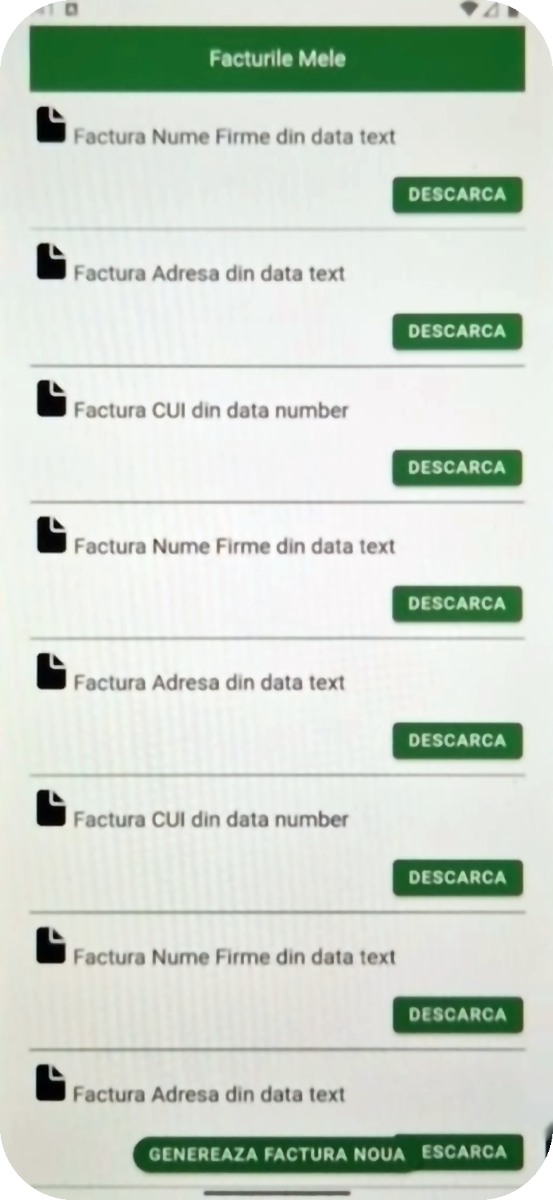
The old app was not wrong, it was dense. Everything carried the same visual weight, and the eye had nothing to catch on. The redesign did not remove features, it established hierarchy: what the user reads first, what they can ignore, and where the decision is made.
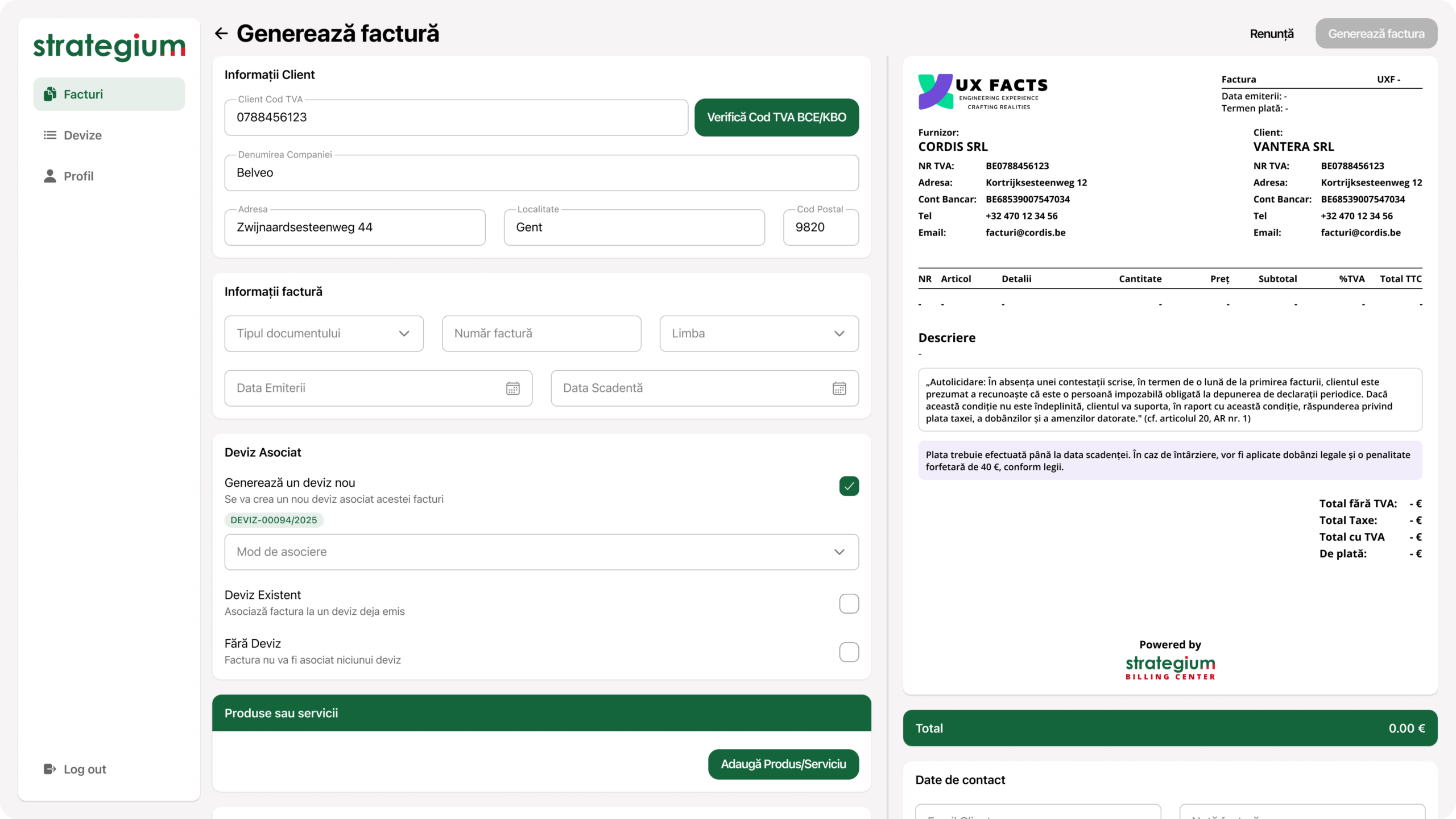
The old form asked for the same details, but with no order and no clear point of entry. Now the screen has one thing to do, and the state of each field is visible.
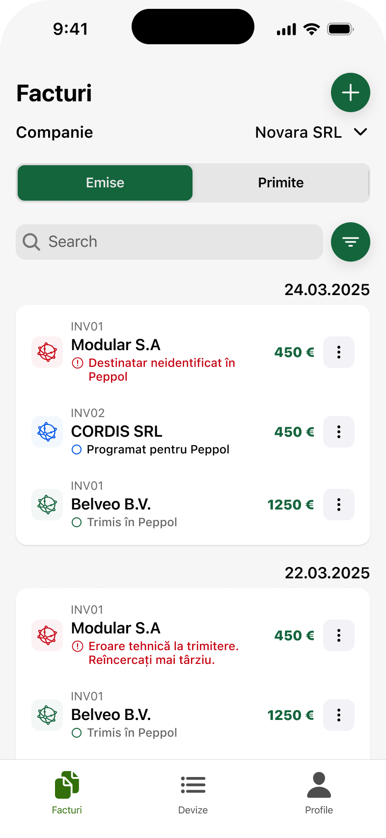
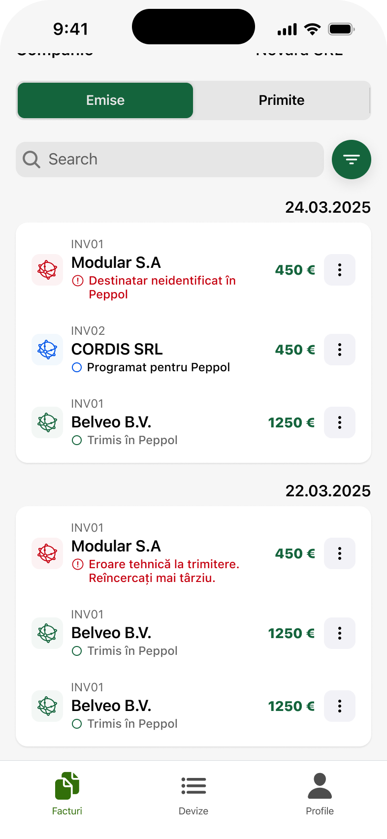
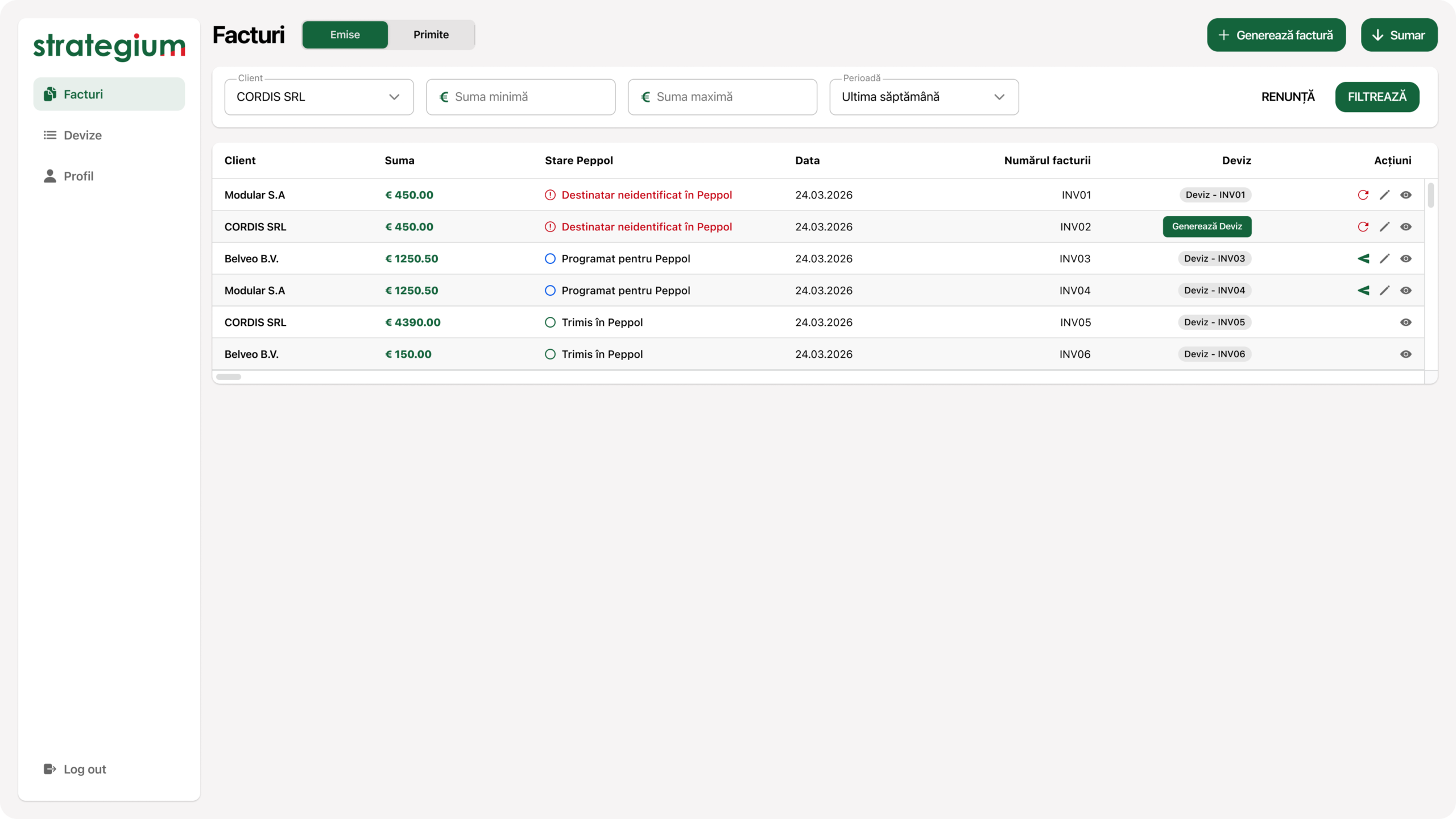
Before, every piece of information carried the same weight. Now the client name leads the row, the amount sits on the right, and payment status is visible without opening the invoice.
Every block below starts from a sentence said in an interview and ends in a screen. Nothing decorative: if a decision does not answer something said in the room, it is not here.
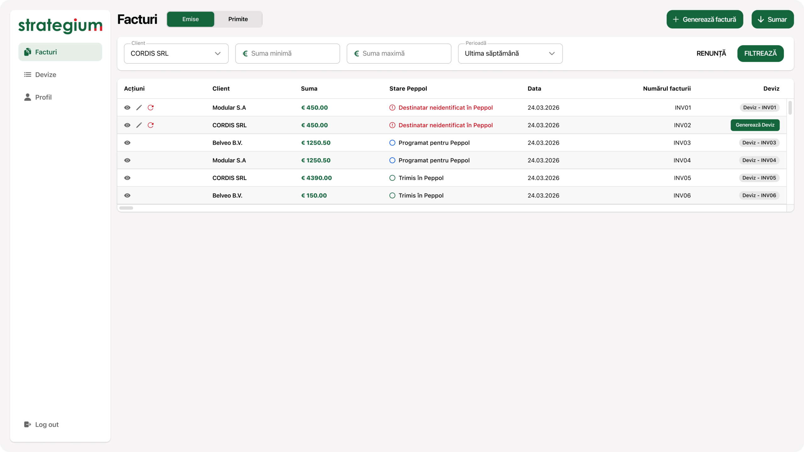
Users wanted invoices sorted by paid and unpaid, grouped by day, because they issue several a day, with the client name most visible. The row is built in exactly the order they read it: who, how much, in what state. The amount sits on the right, where they asked for it.
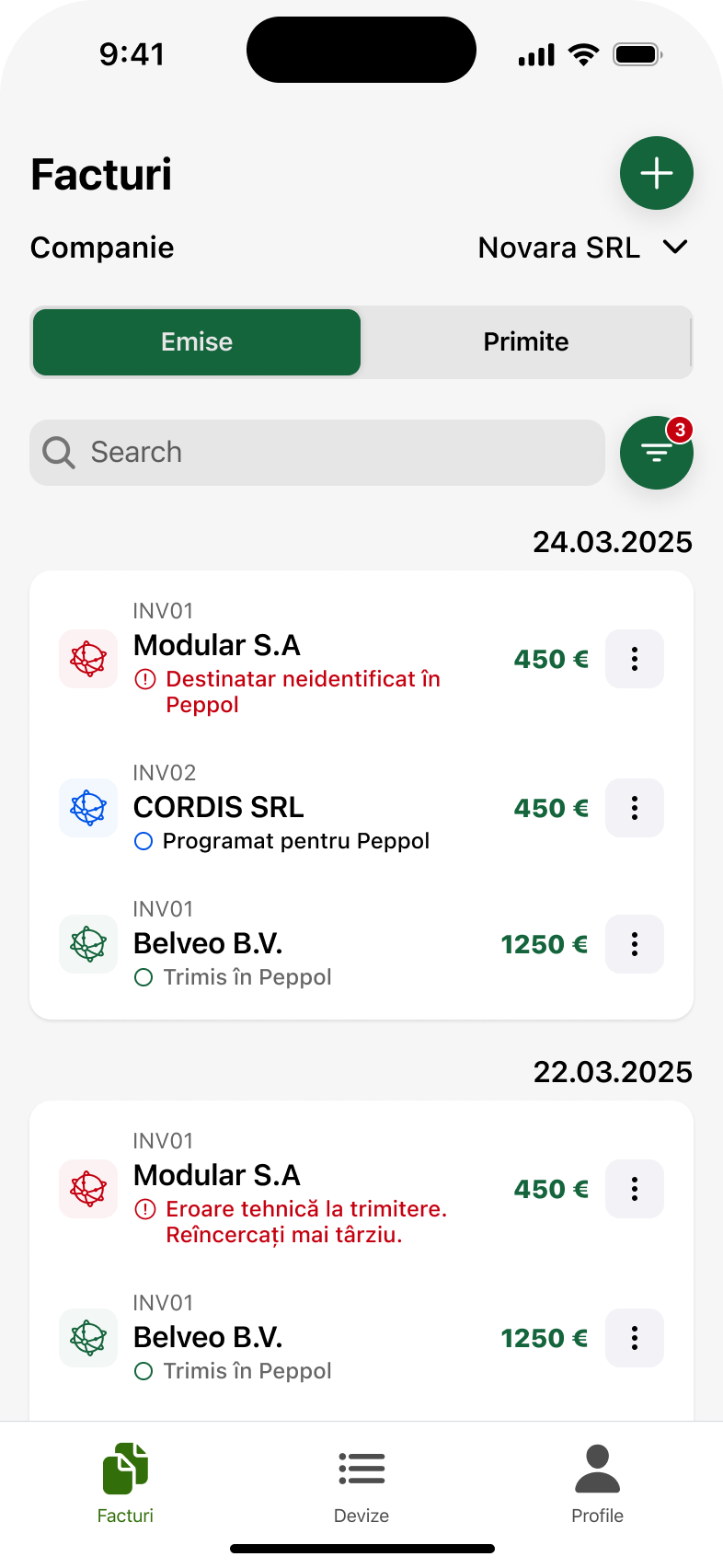
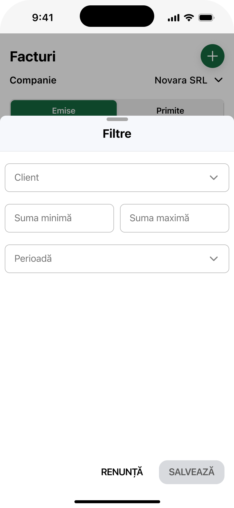
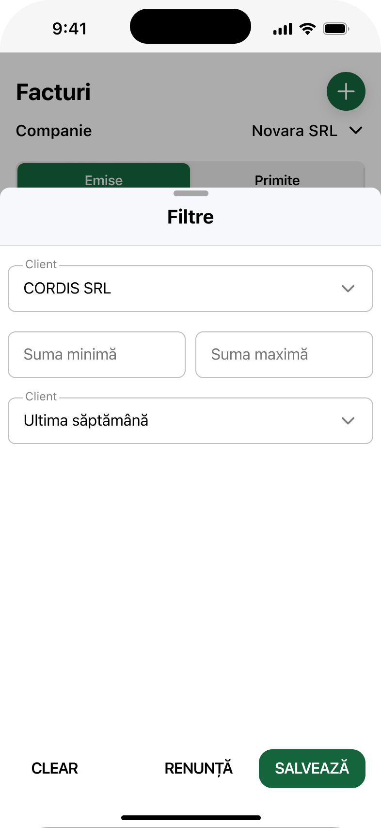
Filtering works by client and by period, with the client list already there, rather than an empty field where you have to type the exact name. When filters are active, it shows; nobody wonders any more why invoices are missing from the list.
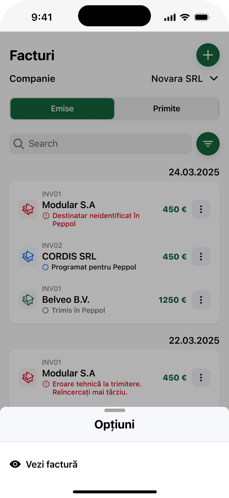
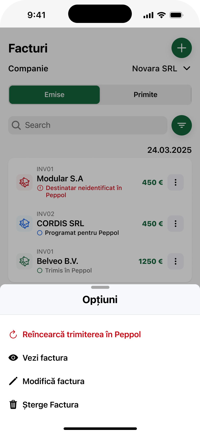
The costliest problem in the interviews: the document did not go out, or went out two or three times, because nothing confirmed the send. Now every invoice shows its options clearly, and when a send fails, the error appears on the document along with what to do next. Resending becomes a decision, not an attempt.
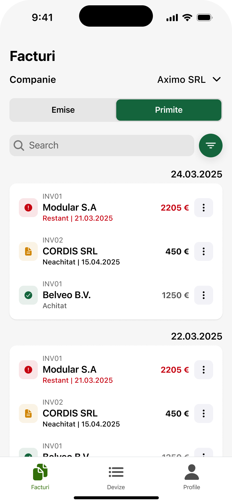
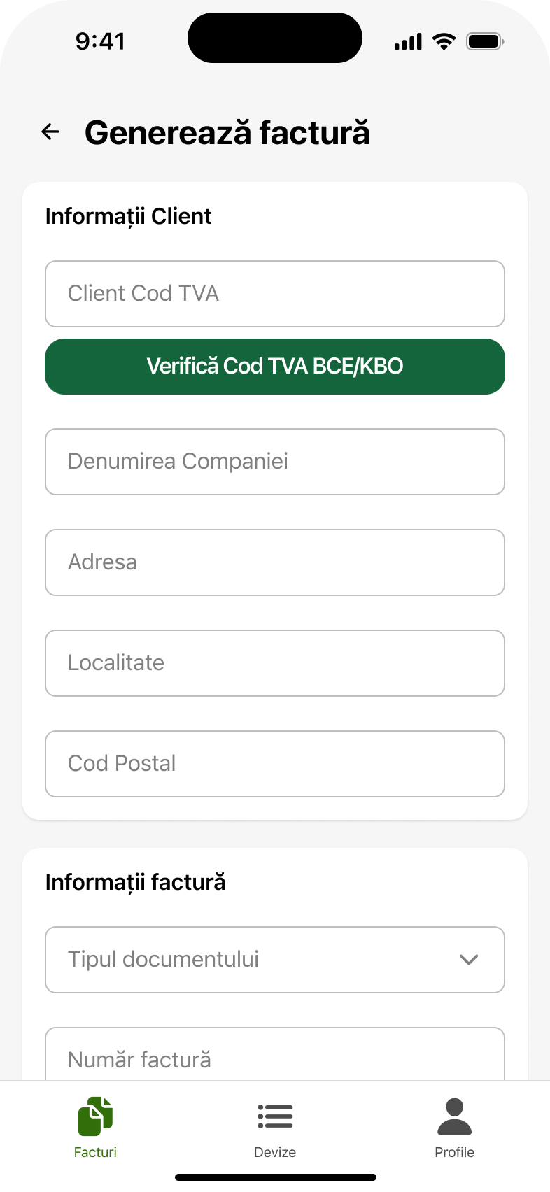
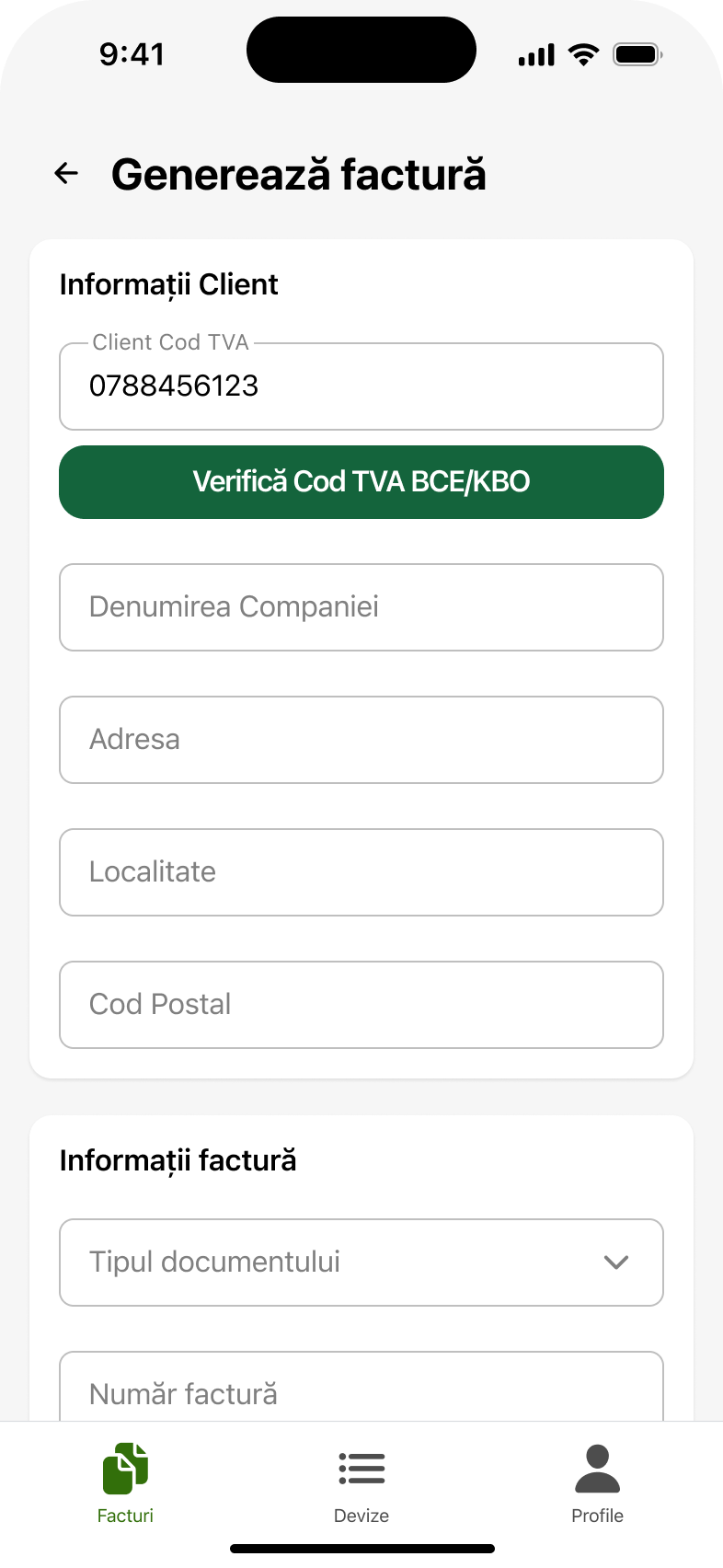
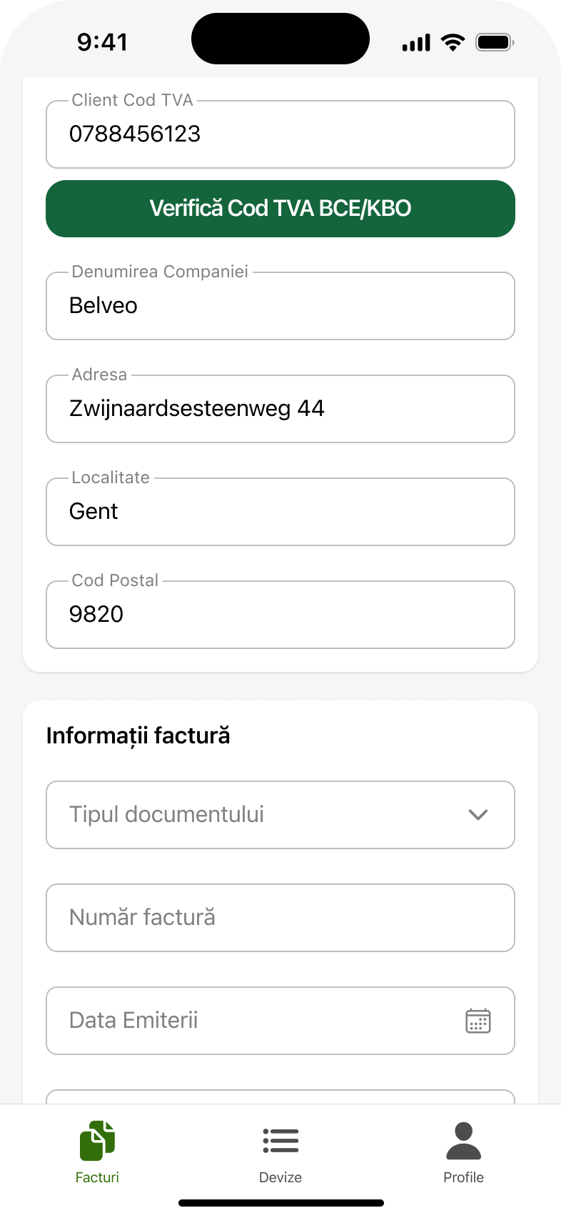
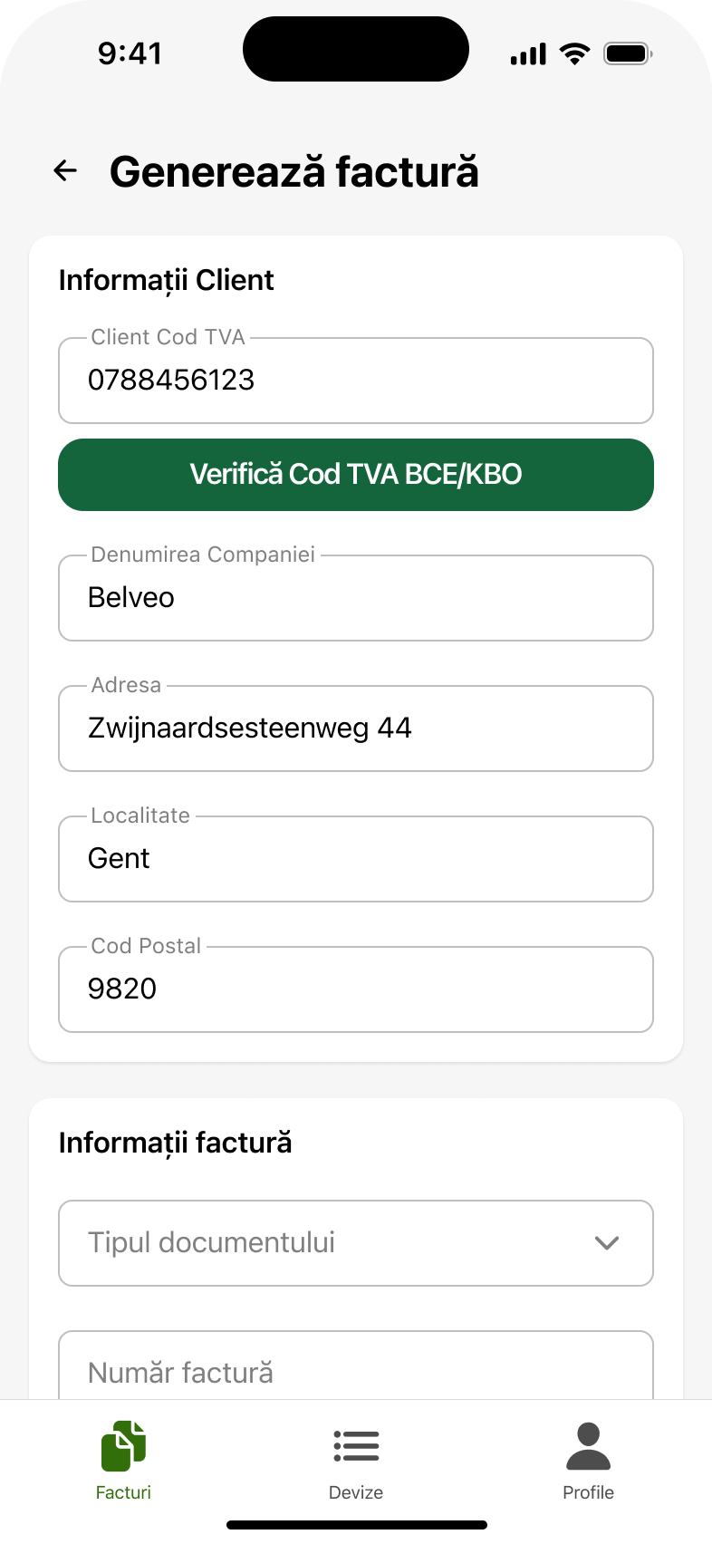
“First the VAT number, the rest automatic.” The company register lookup happens straight from the form: name, address, city and postcode arrive on their own. The user types ten digits instead of five fields, and the data is the official record rather than something misremembered. It also solves the problem of addresses changing without anyone updating them.
The credit note was the hardest part for them. The document type is chosen explicitly, at the start, with the explanation right there. It is not inferred from a checkbox halfway down the form. This is also where the document is linked to an existing quote, if there is one, so the connection is not made from memory later.
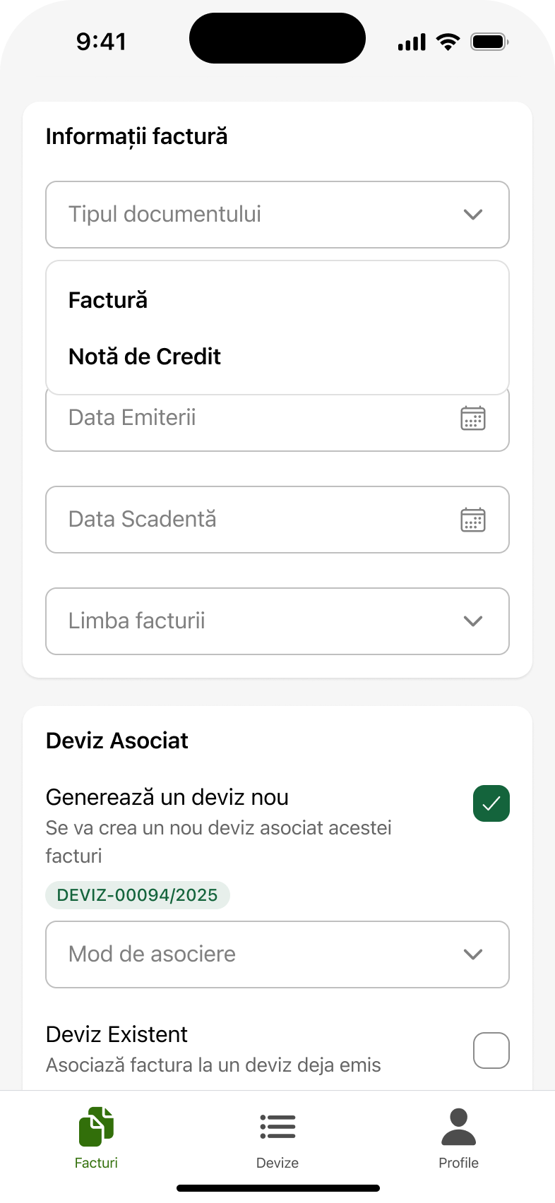
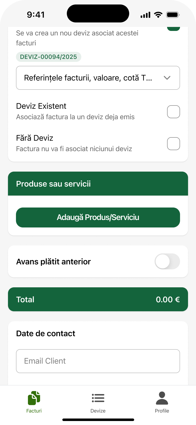
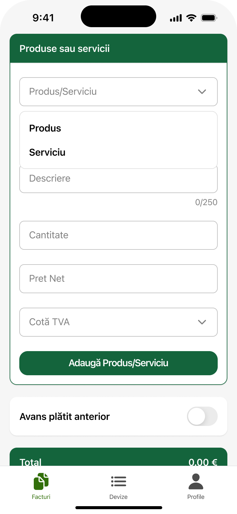
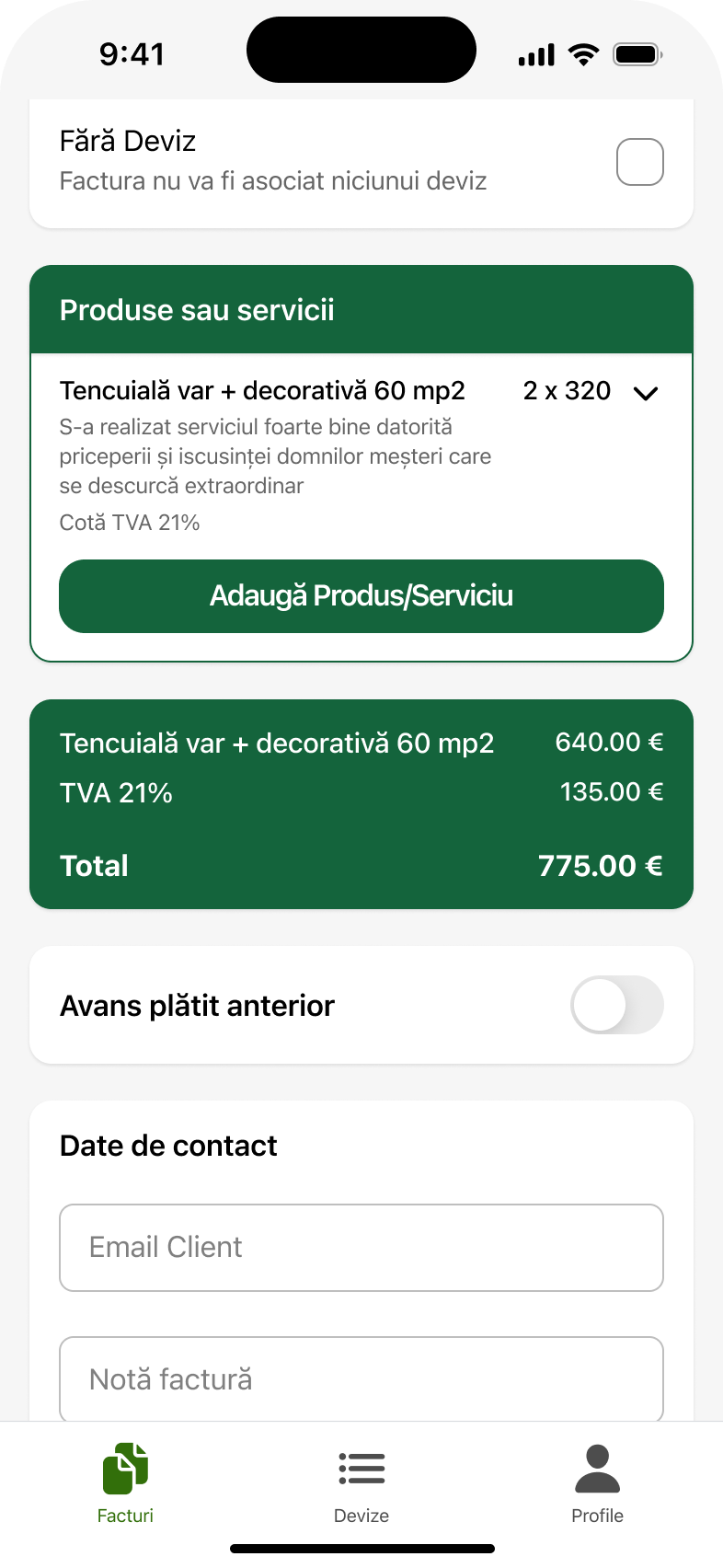
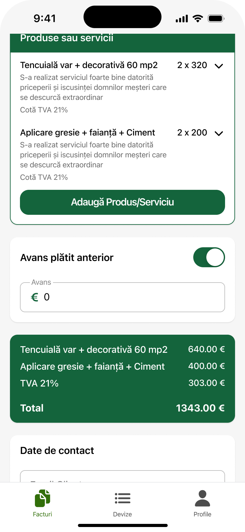
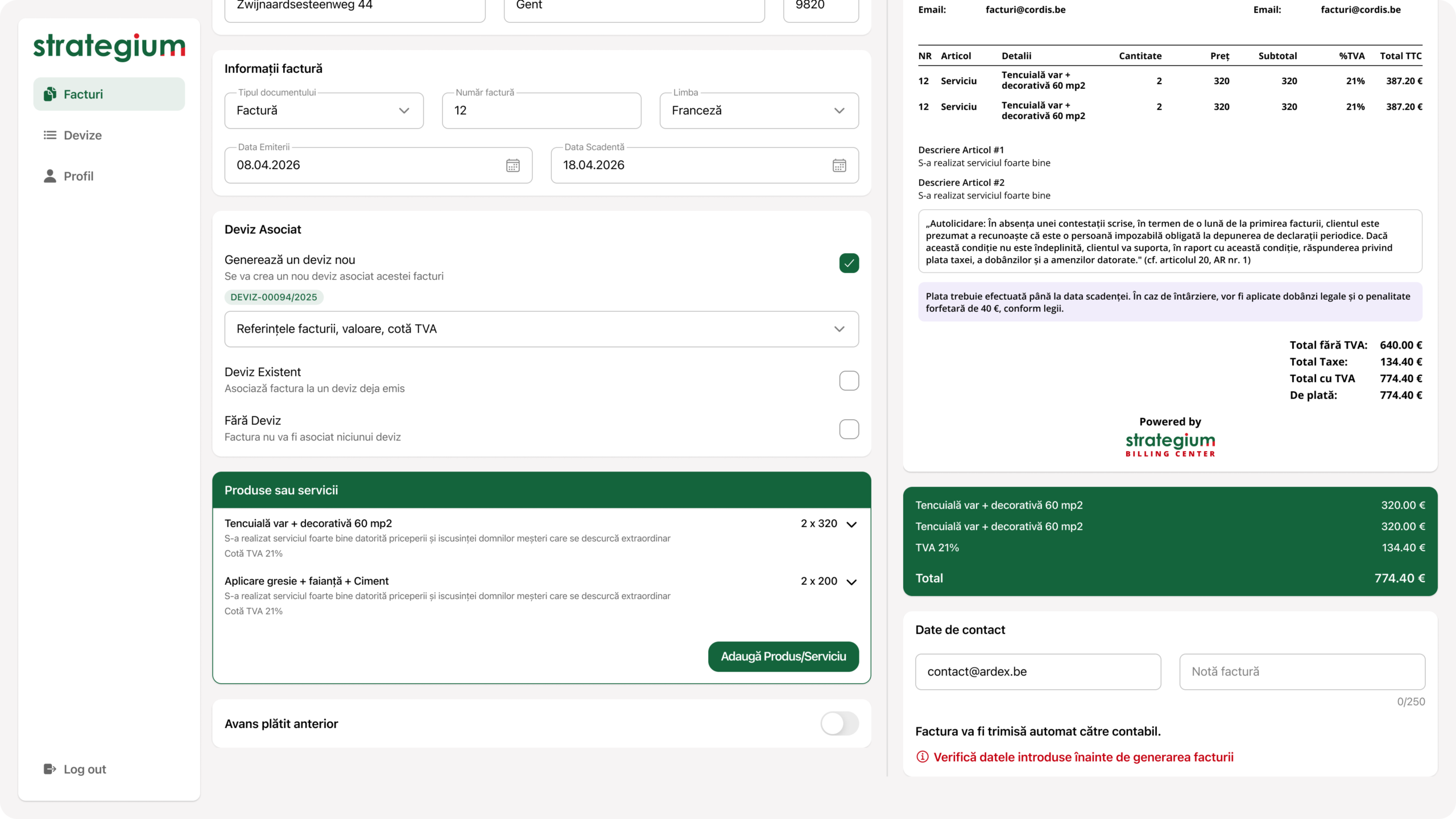
In the interviews, the part that takes longest is describing the work performed. The product or service form is short and repeatable, and added line items appear immediately in the list with their total. You do not discover at the end that one is missing. Every field is in the preview, exactly as they asked.
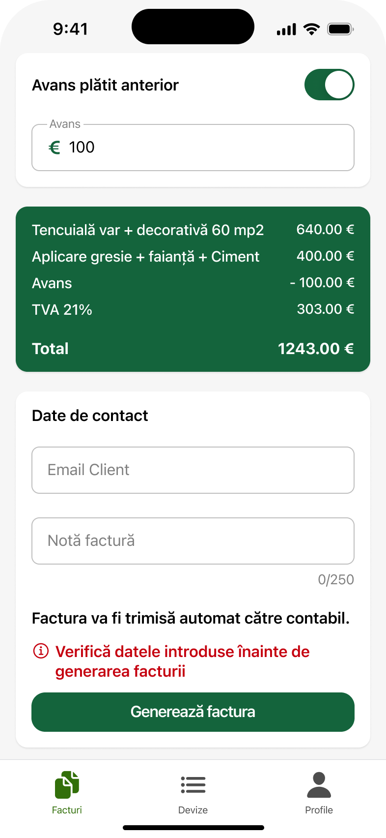
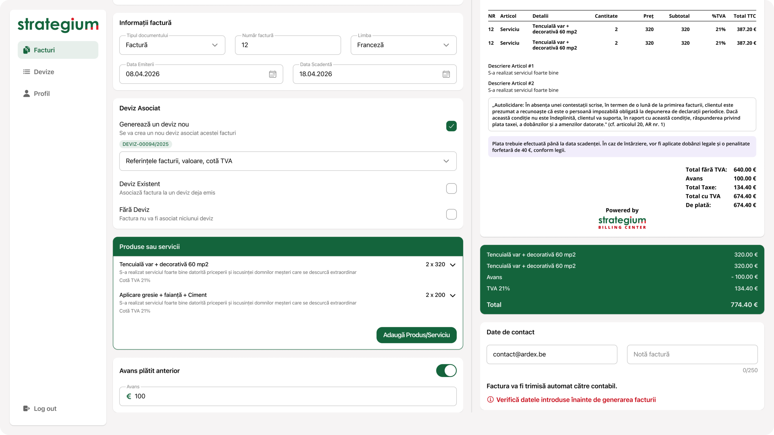
The request was explicit: deposits already paid should be deducted automatically, and the balance due should sit on the right. The total stays visible while you build the invoice, not only at the end, and after sending there is a confirmation rather than a silent return to the list.
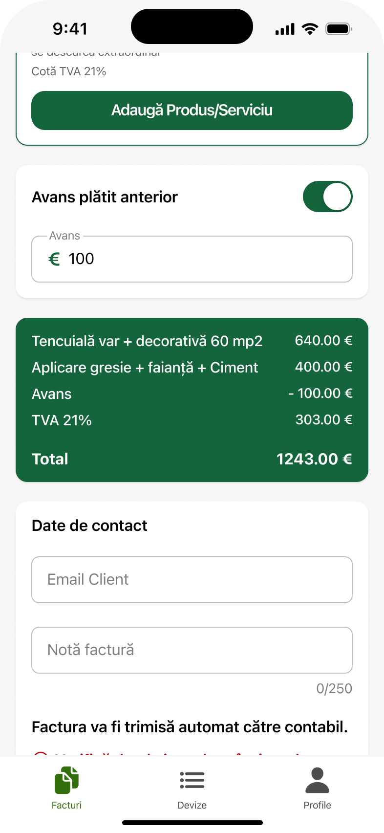

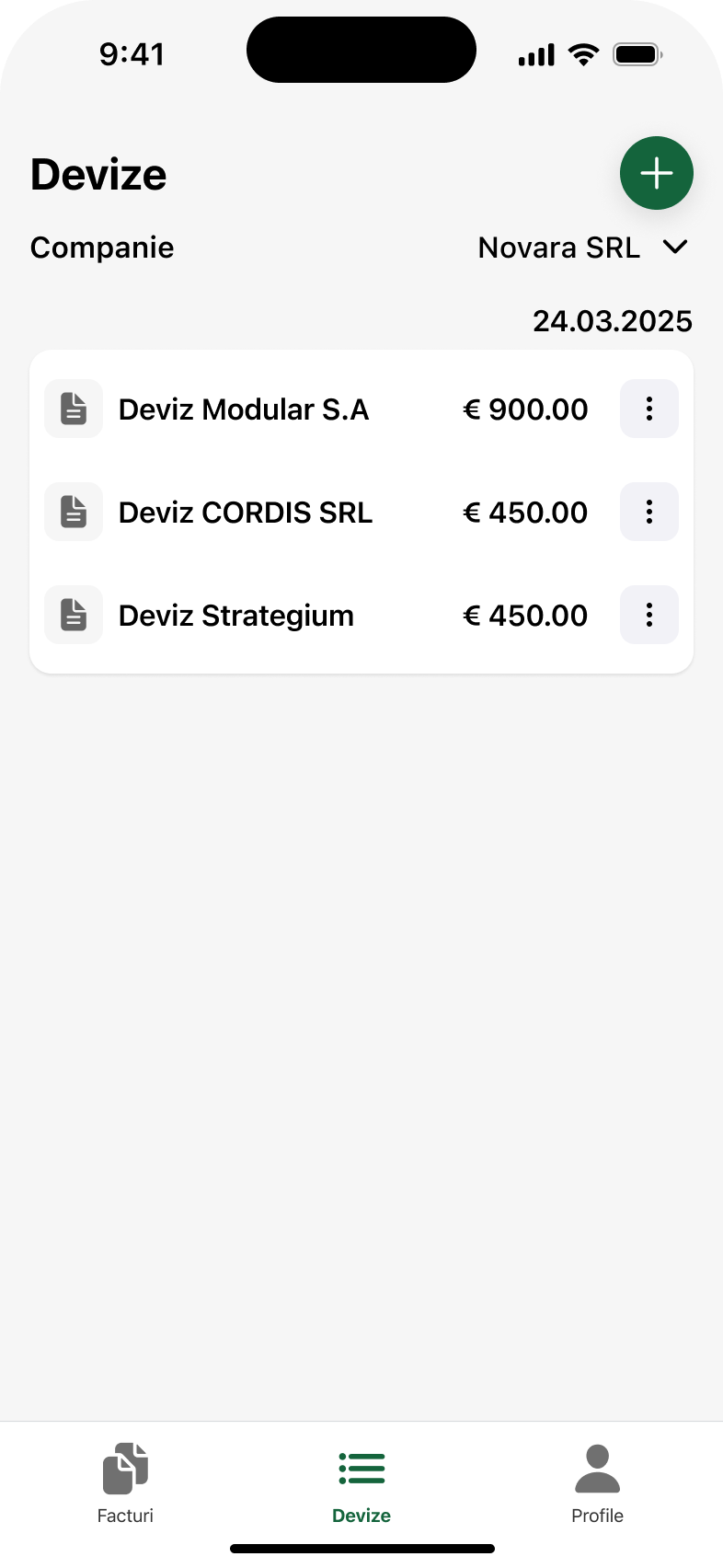
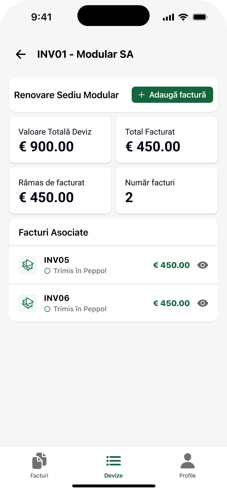
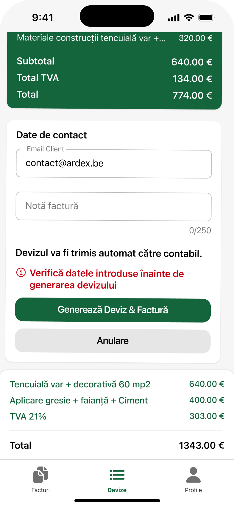
A quote uses exactly the invoice flow, with the same screens and the same rules. Once you have learned one path, you do not have to learn a second. The link between a quote and the invoices issued from it is visible in both directions, with the status of each invoice.
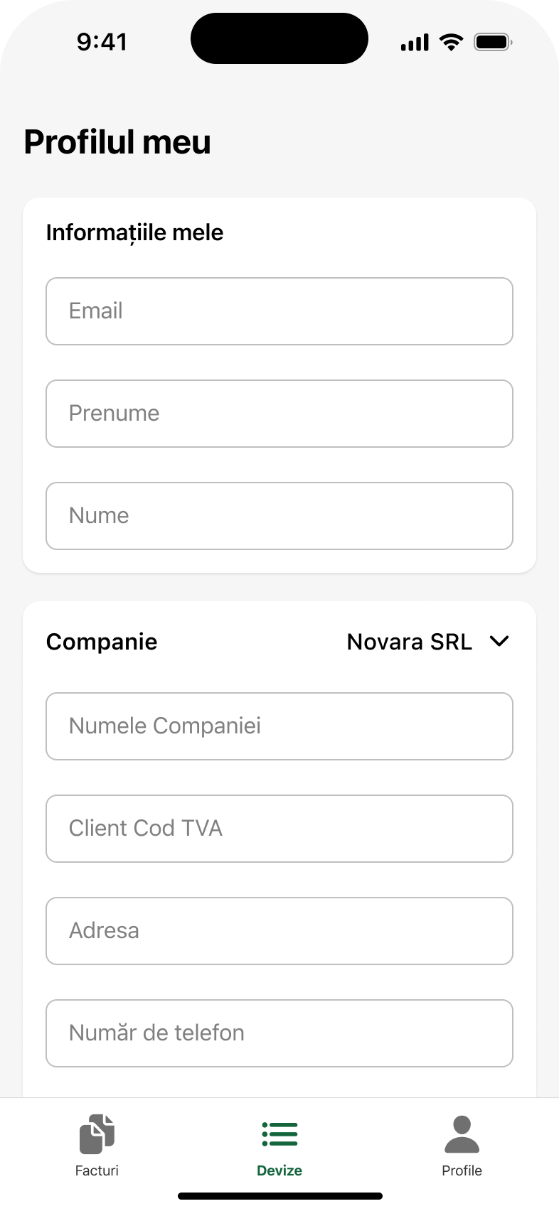
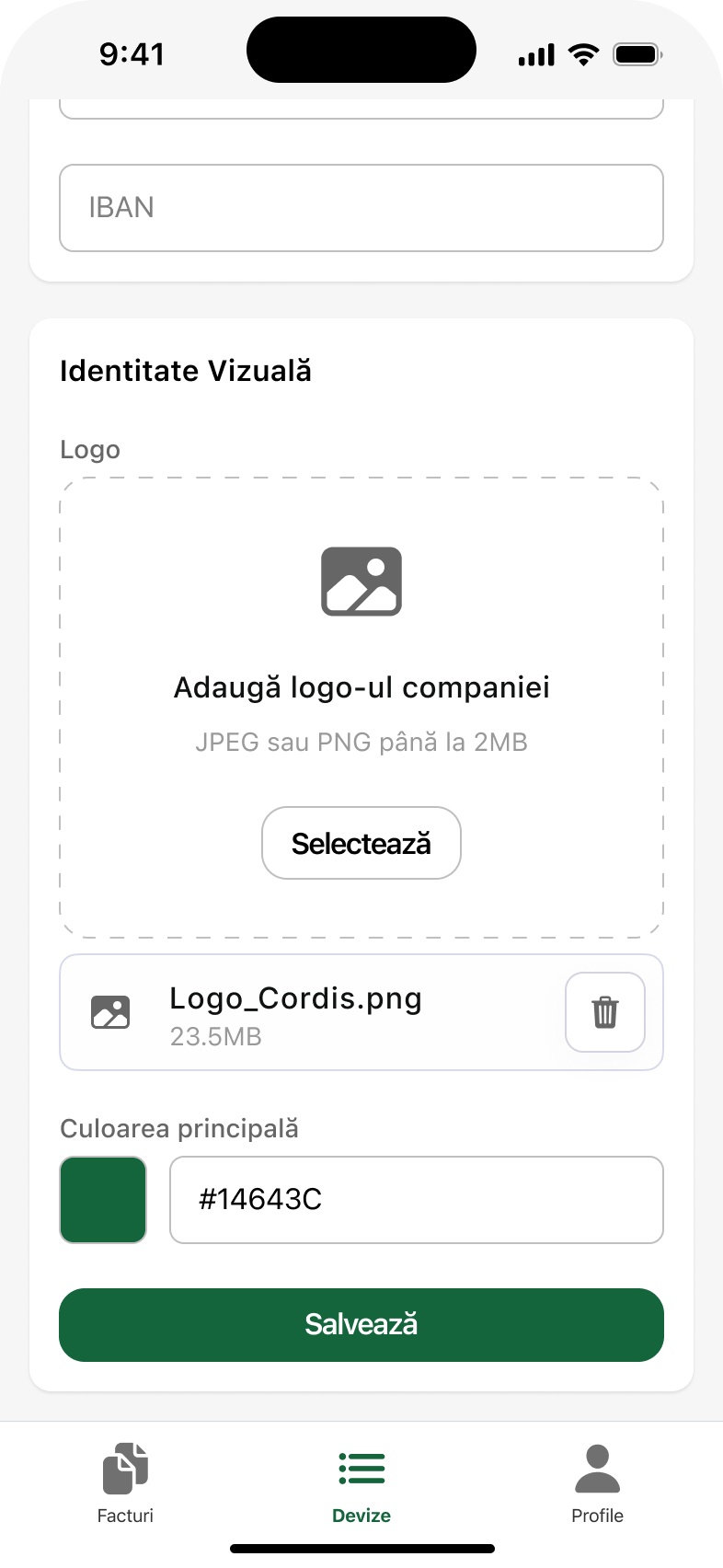
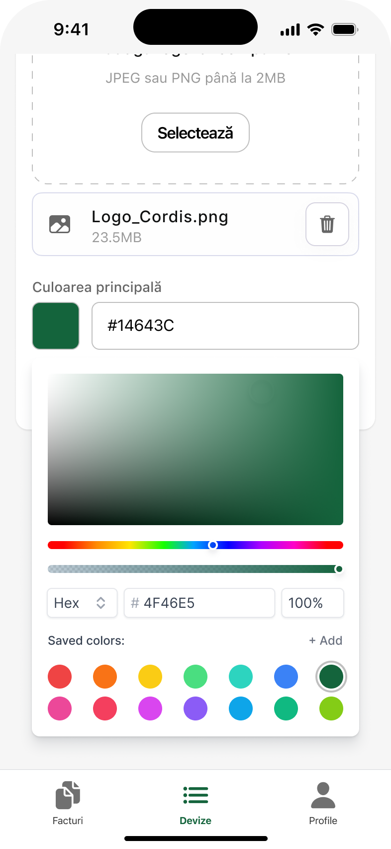
The profile holds the company details, the logo and the brand colour, and these carry through onto the document that gets sent. It came straight out of the interviews, and it has an effect no feature delivers: the user recognises the document as theirs.
Invoicing happens on a phone, but checking happens on desktop, and that is where users were happiest in testing. The large screen does not add features, it adds context: the form and the document preview sit side by side, and the totals update as you type. What you see on the right is the document that actually goes out.
The outcome is qualitative and stays that way. No percentages, no “X% faster”. Only what was observed in testing and after the relaunch, and what can be stood behind.
After the redesign, users returned and praised it as easy to understand and to use. Recurring feedback: “it is clean now”, “it puts them at ease, they are not overwhelmed”.
In testing, people noted that they see the invoice total and the line items faster while generating it, exactly what they had asked for in the interviews.
Confirmations, statuses and warnings before generating. The moment where you do not know whether anything happened disappears.
Users were happiest with the desktop version and with how much cleaner and more ordered the app looks.
Before, when they got stuck, they called the team. The redesign moved the answer into the screen: an explanation at the point of decision, data verified automatically, a visible status for every document.
The last client came with a proposal during the process itself, a sign that users had become invested in the product rather than merely putting up with it.
Account creation and Peppol registration in one step. Today the team creates the account; users would do it themselves.
An in-app help area, as an alternative to the phone.
Release notes, so they can see what changed since they last used it.
Recurring services, so the description of the work is written only once.
The app has the same features today as it did before. What changed is how many decisions it leaves to the user: the VAT number pulls in the official data, the document type is chosen explicitly, the deposit deducts itself, and the Peppol status is visible. In a product used by people who never studied accounting, every hesitation removed is worth more than a new feature.
UXFACTS SRL · CUI 51977507 · J2025042846007 · Str. Vasile A. Urechia nr. 23, Iași, județul Iași